As an employee you are responsbile for ensuring all of your content in Canvas is accessible. With a few simple steps you can make Canvas more accessible for all users.
1. Use the Accessibility Checker in Canvas
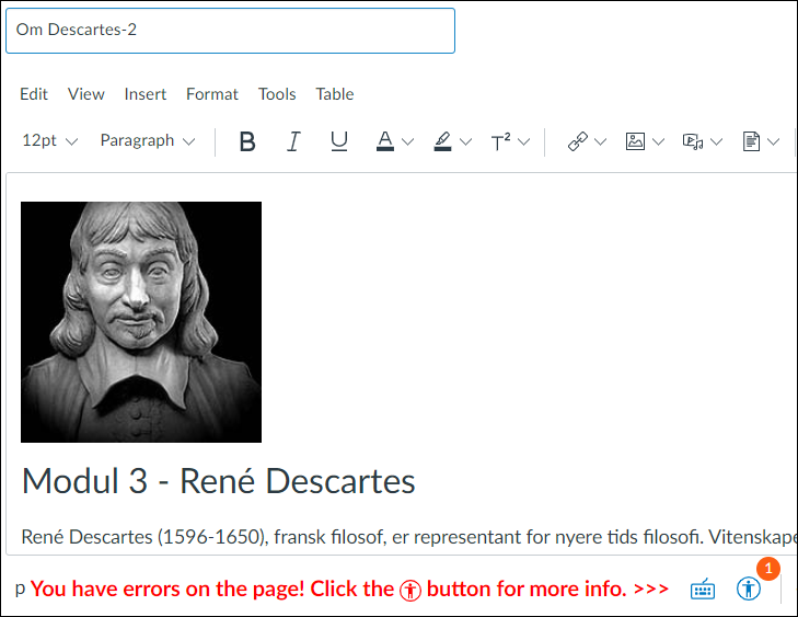
The Accessibility Checker button in the Rich Content Editor automatically checks your content and tells you if something must be fixed.
Remember to check accessibility before you save.
Files that you upload to Canvas should also be checked. Check accessibility in:
2. Always write alternative text for images
Alternative text for pictures is essential for blind and visually-impaired people understanding what the picture is about when they use a screen reader. In Canvas you add an alternative text when you upload the picture, or later in Image alternatives in the Rich Content Editor.
A good alternative text is relatively short, begins with the most important information and describes the picture's motif. The message the picture conveys is what must be described.
Other tips:
- Never use the file name as the alternative text.
- Avoid pictures of tables, text or formulas. Add these to the Rich Content Editor in Canvas.
- Pictures that are solely decorative also have alternative text, but the field must be left blank. Instead use the checkbox Decorative image, to indicate that it's a decorative image.

3. Make good tables
Tables should only be used to present data, and may contain important information for students. Many users have problems understanding the information if a table is too complicated or is not accessible.
Recommendations:
- Place tables in the Rich Content Editor rather than in a Word or PDF document.
- Never use pictures of tables. The pictures are not readable for people using assistive technologies.
- Add a title to the table, and remember to define which rows/columns are headings.
- Avoid merging cells together. This prevents screen reader users from being able to navigate the table in a logical and easy way, and makes it difficult for them to understand how the table is organized.
- Avoid tables inside of tables. The table structure is generally confusing for all users, not just those using assistive technologies.
4. Use heading levels
Heading levels are your best tools for providing organization and logic in your text, and gives screen reader users and keyboard-only users the ability to skip ahead or back while reading.
In Canvas you can find heading levels in the Rich Content Editor. Use heading levels in a logical order, where the page title is Heading 1 and the remaining headings are Heading 2, Heading 3, etc. down to Heading 5.
Also use heading levels when you create documents in Word, PDF and PowerPoint.

5. Uploaded documents also need your thoughtfulness
Tips 1 to 4 also apply to uploaded documents in Canvas - including Word, PDF, PowerPoint, Excel, etc. To avoid lots of extra work later it is essential you make sure the document you are uploading is already accessible.
Be aware of the following:
- Scanned PDF documents are often just saved as pictures, not text. Use the 'Recognize Text' tool in Adobe Acrobat (UiO Program kiosk) to make the text readable and searchable for all users.
- Correct contrast ensures that the content is easy to read. This is something that benefits everyone, especially in circumstances with poor lighting. Colored text should not be used since we each have different abilities perceiving colors and their meanings.
- Remember to add good alternative texts to SmartArt, pictures and diagrams in PowerPoint.
- Avoid pictures of tables or text.
Learn more about accessibility!
- Read UiO's Checklist for universal design of web content
- See The Authority for Universal Design of ICT's 'Checking your own website' for practical tips on reviewing contrast, headings, links, images, etc.
In Norwegian only:
- For good tips for Canvas, Word, PowerPoint and Inspera, take the online Canvas course Universell utforming av dokumenter og nettsider
- For those especially interested: Take a deep dive with Difi's online course Universell utforming. E-læringskurs for nettredaktører og skribenter

Useful tools and resources
Accessibility in Canvas
Instructure has its own webpage with tips and advice for using screen readers, keyboard shortcuts, high contrast, etc. with Canvas, to help users with special needs.
Accessible tables in Canvas
The Canvas course 'Universell utforming av nettsider og dokumenter' (in Norwegian only) has good advice about tables in Canvas.
High contrast user interface in Canvas
Under Account in the global navigation menu there is a button to switch to a user interface with higher contrast. High contrast improves the color contrast for text, buttons and other graphic elements in Canvas.
Have text read aloud in Canvas
Microsoft Immersive Reader is a learning tool for all Canvas users, where the text in Canvas can be read aloud and formatted for easier reading. This tool is useful for the visually impaired and for people with reading challenges such as dyslexia.
Make Excel documents accessible
Microsoft has a webpage with tips on how to make your Excel worksheets accessible for all users.
Tool for checking contrast
The website Color Review makes it easy to find good contrast. If you find a color combination at the AAA level, then you will have done others a big favor!